Herzog & de Meuron Basel Ltd.
Rheinschanze 6
4056 Basel, Switzerland
Email: info@herzogdemeuron.com
Phone: +41 61 385 5757
Lecture
Jacques Herzog: Collaborations with Artists, Museum Projects, and our first Building in America. Lecture held by Jacques Herzog at the Symposium Art and Architecture hosted by The Chinati Foundation, Marfa, Texas, 25-26 April 1998. In: Jeffrey Kopie (Ed.). Art and Architecture. Symp. Proceedings Art and Architecture. The Chinati Foundation, Marfa, Texas, United States. 25 - 26 April 1998. Texas, Chinati Foundation, 2000. pp. 31-58.
In three separate parts I will try to approach the subject of art and architecture as part of our daily practice. In the first part I’ll mention a few collaborations we’ve had with artists to date, in the second part I’d like to present museum projects and built museums, and in the third part I’d like to present our first building in this country, the recently finished Dominus Winery.
Over the years we’ve come to understand more and more that artists shouldn’t do architecture and architects shouldn’t do art. I hope we can talk about that later. We have also understood that it’s very important to fuse these things, to bring these things together. In many projects we came to a point where we found it absolutely important and necessary to involve an artist to make the project better. This involvement was not to have a decoration, or to add a piece that would make the project nicer, although this could also be a possibility. We wanted more of a collaboration, to have the artist be a part of the team and we’ve been lucky to have two artists living in Basel, Helmut Federle and Rémy Zaugg. They have been friends for a very long time, even before we studied architecture, so it was natural for us to collaborate with them, to look at the world through the eyes of an artist as well. For instance, both of these artists were critiquing museum buildings even before I started looking at museums, so any debate about museums is something about which we have been familiar since very early on, and it has been a serious concern, not just as an architectural issue.
We’ve been lucky in another way, in that Basel is a city of art with fantastic museums. It’s a city where contemporary art has always been shown at very early moments in artists’ careers. For example, I saw Donald Judd’s drawings in the early 1970s at the Kunstmuseum in Basel and they impressed me by their lack of decoration and by the direct way they communicated the artist’s idea. Another important artist was Joseph Beuys, who played an important role in a very special way. When we left university in the mid-1970s we had almost no work, but we really wanted to express ourselves creatively, so we accepted work from a carnival group in Basel. Basel Carnival has an important and long tradition. We did the costumes and the masks for this group for many years. After a while we became bored because Carnival is basically about irony and treating subjects polemically; it’s never really about taking a political subject and making the whole performance on the street the main event. So sometime between 1976 and 1978, I don’t remember exactly when, the city of Basel bought “Feuerstätte I”, an important piece by Beuys. Of course the purchase was a big political issue, the piece cost $300’000 at the time. The city bought it, and that became a main subject at Carnival. Many groups treated the subject in their typical, ironic way. We wanted to turn the whole event into an artist’s performance, including Beuys and his work. He agreed to work together with us, and he designed a performance on which we assisted him. This was, in a way, our first collaboration with an artist.
What we did in fact was copy the sculpture “Feuerstätte I”, and the Carnival group performing the piece carried these iron and copper sticks on the streets for three days. They were dressed in Beuys’s felt suits and we made gold masks for the whole group of sixty people. By the end of those three days, this sculptural copy of “Feuerstätte I” became a different thing. By being carried through the streets, it became a different sculpture. This sculpture became “Feuerstätte II”, which is now on display in the Gegenwartsmuseum (museum of contemporary art) in Basel. This experience was very important to us because it allowed us to learn more about Beuys’s world, which was quite a shock and quite different from our experiences at the ETH school in Zürich, where we studied under Aldo Rossi. So after Carnival we were familiar not only with the very southern world of Aldo Rossi, but also with the northern, romantic world of Beuys. This became very important in that Beuys used materials in a totally new and unexpected way.
Rémy Zaugg is the artist with whom we’ve collaborated most; we always have one or two projects that we are working on with him. The idea is to truly examine all of the different possible ways of working with someone, from very small-scale to urban designs. What we’ve learned from our collaboration with Rémy is that the artists in whom we’re most interested are very strong conceptually and their work is not solely concerned with aesthetic attributes. So Rémy’s thinking is what we are interested in; it is a different view on things.
This shows the campus of the university in Dijon, France. Rémy looks at the world, at this campus, as if it it was a surface of a painting. He sees things from such a different angle. This is the thing which fascinates us and it remains interesting in totally different projects as well. The case in Dijon was reversed, here the artist came to us and asked us to collaborate, because he was commissioned to do a museum on the campus. It’s a campus that was built in the 1960s and again in the 1980s, when the Socialists were powerful. There was a lot of money to do many buildings, including this art museum. Rémy needed an architect so he contacted us. The first thing we needed to do was a master plan, because we didn’t know where to put the museum. We analyzed this campus, which has a very strange structure with very powerful buildings from the 1960s; they are a kind of a mixture between Perret and Le Corbusier; other buildings in the background are more fuzzy. The whole place seemed to be losing its integrity and urban quality, so the master plan we did was very conceptual. We saw that the city of Dijon has onion-like layers around its center. We wanted the campus to be part of the city, not just an isolated place. We tried to change the campus to make it more permeable to the surrounding neighborhood of the city. It somehow became a very didactic lesson to the people working there, and the communication with these people became the most interesting thing about the project. We often tried to turn existing structures into courtyard buildings; we then inserted them in layers to allow for connections of the campus in these directions. The radical, almost schematic graphic design of this plan demonstrates Rémy’s role and his strong influence on this project. It illustrates the artist’s way of speaking very clearly in very simple terms. Green for green areas between built areas, grey for existing and so on. What finally turned out to be so simple was quite difficult to achieve at the beginning. In the end we couldn’t build the museum because the Socialists lost power and that was the end of many large projects in France. But we were able to build dormitories on the campus with very little money, just before the Socialits lost power. We could have done one building, a very long building which sort of stretched between two “allées”. And we integrated a new road on the campus and our master plan became an official plan, the master plan. The people from the university, in a very French tradition, called this new avenue “Avenue du 21e Siècle”: The Avenue of the Twenty-first Century. So this is part of the twenty-first century.
Another collaboration with artists came about in 1991 when we were invited to exhibit our work in the Swiss Pavilion at the Venice Bienale. We didn’t want to do this show ourselves. We did the buildings, but we didn’t want to do the pieces which would explain or demonstrate these buildings, so we asked artists to take photographs of their choice of our buildings and to make the show. So it was not only our show, it was also the show of the four artists we invited: Balthasar Burkard, Hannah Villiger, Margherita Spiluttini, and Thomas Ruff. Hannah Villiger usually does portraits of her own body, based on Polaroids which she blows up. In this case she enlarged a Polaroid of one of our buildings. This is the first photograph that Thomas Ruff took of one of our buildings, and it was the beginning of a collaboration which continues today. We were interested in Thomas’s work because at first glance it’s very straightforward, but it becomes ambiguous as you study it in depth. We were also struck by the different groupings of his work, which reminded us of our own strategy of establishing several lines of work, separate strategies that can be worked on in parallel. His lines include his portraits, his stars, his houses, his posters, and also his private collection of newspaper photography. This is a picture that Thomas took of Dijon; it has an almost sad aspect to it.
Thomas took new pictures of our buildings for a show at Peter Blum’s gallery in New York. This photo of the Ricola storage building has this frontal view that reminded us very much of Thomas’s portraits.
Another project is on a campus in Eberswalde, near Berlin. We were commissioned to do two buildings. We proposed adding these two buildings so that they would complete a square, which was one of the few that remains in the old city in Eberswalde, in the former East Germany. We decided to add these things like missing teeth in a mouth, not to find totally new shapes, but to invent a new urban type.
This is a seminar building and a library which is now under construction, which is in addition to the existing library. The existing building is in the typical style of the place; it’s not really nice, but it has some character and atmosphere. We wanted to do something which was different, but at the same time have the structure reflect the character of the old architecture. This is the existing library and the new piece linked with the corridor. It is a very, very simple rectangular box, three floors, almost like stacks of books. There was no possibility to turn the library into a spatially interesting thing inside, which would have meant a higher space or a more public space for circulation – informal, unprogrammed space. That was a restriction we had to accept, so we radicalized this restriction and turned it into a kind of stack with a storage of books. In between the books, the readers and the students find their space with little windows and bands of glass on top, a structure a bit like we did at the Goetz Gallery. From the very beginning we were interested in having pictures all over the building, so as to totally mask the box. The box would be very simply shaped, but the fact that it’s totally tattooed would destroy a simple reading of this geometrically clear, clearly shaped building.
When we began we found a method for applying photographic pictures into the surface of concrete. We applied this technique for the first time in a sports center in France. It’s a method which stops the concrete from drying in some areas, allowing us to wash it out very carefully so that any type of photo will appear. This allows us to use the stone surface of the concrete like photographic paper. The natural grain of the concrete and the grain of the photograph interfere with each other in very interesting ways; from further away the picture appears very much like a photograph, but the closer you come it turns out to be stone and the picture almost fades completely. So it’s not like a Pop Art poster, its visible evidence is always changing. Once we discovered this technique, we knew this could be interesting for an artist like Thoms Ruff, who is very open to new ways of dealing with photography, so we asked him to work with us on the project in Eberswalde. Thomas has a collection of images known as his archive series. They are images that for some reason attract his attention; he finds them in magazines and newspapers and collects them and uses them later in his exhibitions. We thought that this collection would provide a fantastic resource from which to take pictures. Thomas agreed to work on the project and he made proposals of images to employ in covering the entire façade.
The images are in repetition horizontally, and changing vertically; they were images printed on concrete as well as on glass. The larger ones are glass bands and the smaller ones are concrete slabs. With daylight, when no light appears inside, the building looks homogeneous, like a monolithic block with images running around the building. Behind each small window is an individual table for reading, and the upper, wide bands is where daylight enters the interior of the building.
Using photography was very interesting politically and socially in this project, because the university is in the former East Germany and there was conjecture about some of Thomas’s motives. Of course, Thomas played the political game very cleverly and he used charged images, including a skull, a “memento mori” image – a very traditional image for a library. He also used an image of people escaping from East Berlin in 1961, when the Russians were building the wall. We found that many people at the university and in the surrounding area still couldn’t deal with the political content of these images, but as architects we were only interested in having images on the façade; we wanted to change, to totally destroy the purely geometrical shape of the box.
Another collaboration arose when the Pompidou Center asked us to do a show. This was clearly an occasion where we wished to do something with Rémy Zaugg. As you may know, Rémy curated a show of Alberto Giacometti at the Musée d’Art Moderne in Paris. It was one of the most brilliant shows we had ever seen, so we asked him to develop the concept for our show. Initially this may have sounded like a strange question, but he finally liked the idea very much.
Most architecture shows are like shows of artwork, just less good. We wanted to void this fact, and create something very powerful, something that expressed not an artistic power, but an architectural power, made even more powerful by the fact that it was done by an artist. We wanted to have everything in one space with no subdivisions and no inner walls. Rémy laid the material out on tables under glass, and he created a pattern reminiscent of a city plan. The tables with models atop them were slightly lower, so that the flatness of the installation became a major sculptural quality. The light expressed the same order, it was extremely bright. Upon entering the exhibition you were struck by the things that were really, as Rémy said, “brought to daylight.” The projects were laid out chronologically, with no project given more or less hierarchical weight. We created interesting connections between the things that extended a bit over the tables. For example, the models of the Signal Boxes #1 and #2 were spatially related, almost as they would be in a city landscape. The chairs were normally arranged between the tables, a bit like in a library. The atmosphere was more that of a library or a study center than a show of pictures on a wall. We also installed some monitors showing videos about our work; these monitors were treated the same way. We added some important pieces that artists had created about our work or which related in some way to how we think about the city or about perception, about similar issues.
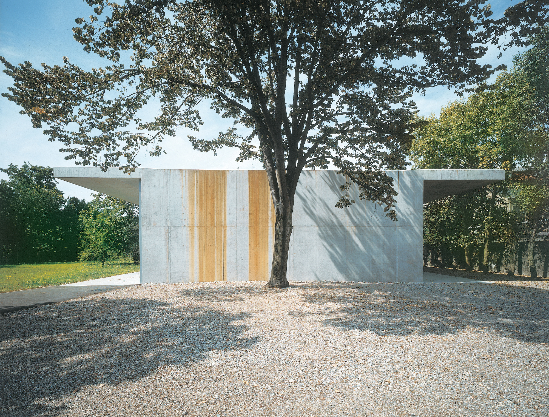
There has been one other collaboration with Rémy, designing his studio. This was very tough because his work is about perception and it’s very critical about museum spaces. You may know his very impressive and thick book entitled “Die List der Unschuld”, where he describes Donald Judd’s sculpture of seven steel boxes and its position in the Kuntmuseum Basel. The whole book is a lesson about the relationship between space and works of art. Doing this studio was a real test for us to show how a museum space should be, because even though it’s a workspace, it still has the character of a space where art is viewed. We did a very simple scheme with two roofs and two canopies. One canopy relates to this wall, creating a simple space outside, and the other almost opens the studio to the garden, which was landscaped by Rémy himself. Basically he flattened out the whole garden and treated it like a painting. He made it flatter than flat, it’s probably the flattest spot on the planet.
We did something with this building that we are trying to do in quite a few current projects – we treated the building like a natural object. We collected rainwater on the roof and the water just falls down, as if coming off a rock or off your own head as you walk through the rain. This water created interesting paintings on the outside, reminiscent of Morris Louis. Of course this wasn’t done intentionally, it should only be rainwater and algae running down the wall, but the fact that this other substance became visible was alarming. We found out that the factory close to Rémy’s grounds had very old technology and it was pollution from the factory that became visible on the wall. It wasn’t dangerous, but still we could see the consequence of this factory, and we understood why the property was so inexpensive. In the meantime they’ve stopped production and Rémy will be able to buy even more of this property for a good price! We decided finally to keep the water stains and to let it be part of the weathering and aging process of the building. In the evening other sections of the building reveal themsevles, there’s storage and a place to write. There is more production space and also a space for presentation. The plan shows the existing buildings, including the villa which belonged to the former owner of the factory, the huge factory buildings behind, and the new studio. The skylights on top of the studio are arranged in a very simple way, I’ll talk about that later. The layout is very simple, two studios, storage, and a bathroom.
This studio was a very important experience, especially in terms of natural light. It’s like a full-scale model for one type of gallery we are doing for the Tate Gallery at Bankside. Daylight enters from the side, from floor to ceiling. The skylights are cut into the ceiling in simple rectangular forms, inserted with etched glass slabs flush with the ceiling. The advantage of this is that it’s technically very simple and it creates a very homogeneous spatial quality. The ceiling has the same material quality as the walls, so you don’t get the feeling that the ceiling flies away from the room. And yet it’s very bright and it’s very relaxed and generous. For this studio the technical background is very simple, almost primitive. And the roof and the floor are basically the same structure, which then opens the pavilion to the garden.
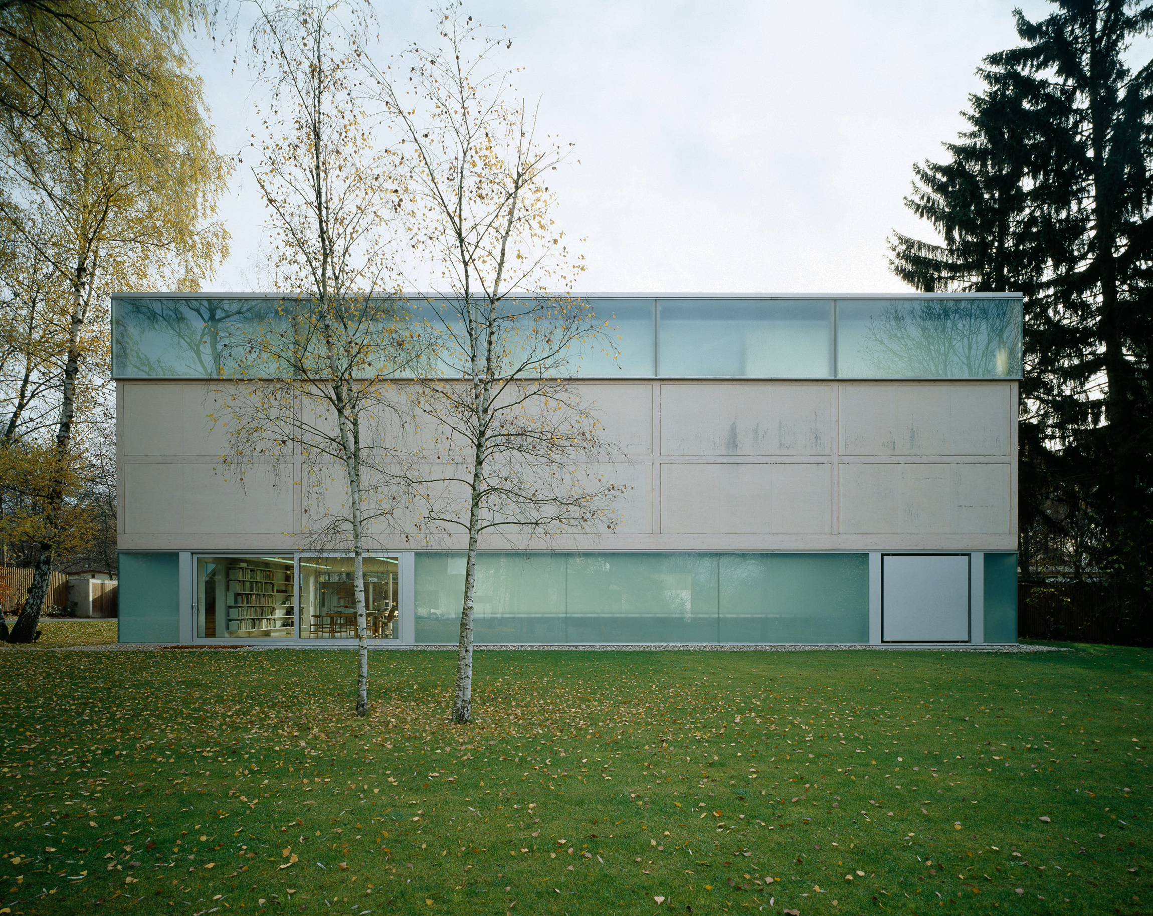
The next group of things I’d like to talk about are museums. First, the Goetz Gallery in Munich, a private collection of contemporary art which is run a bit like a Kunsthalle. The public can visit by appointment and the shows change about every six months. This is an elevation from the street side and from the garden. You can see at first sight how the building works as a simple box, but in fact it has two stories with the lower floor partly sunken in the garden. This is because we could not make the building higher and we needed to find a way to have two equally important floors. So we developed the idea of sinking the building into the ground. It’s a very simple geometry but it has a complex spatial system. It is one piece with two tunnel-like openings which cut across. But it can be read as a structure standing on two socles, and it can also be understood as something more solid situated between two light bands. The different appearances of the building become more evident with the change of light during the day as well as with the change of seasons. It’s certainly one of the best examples to show that many of our buildings deal with the issue of the change, that they enhance the fact that light and seasons change all the time. The material we used is very pale birch plywood; we also planted birch trees as a landscape element. We increasingly worked on the combination between the plants of the garden, the landscape, and their relationship with the building and its materials. We also used etched glass and anodized aluminum so that with daylight, these three very different materials seem very close to each other. With the change of light they differentiate very clearly. As the light inside becomes stronger, the structure becomes more evident and begins to reveal other qualities not seen before. In some light conditions it resembles a lantern in the garden that, in this case, we’ve arranged in a very simple way.
The glass panels of this building appear in many different ways. It’s slightly mirrored in areas, so that the building becomes a part of the garden, like a pond or a frozen section of the garden. When you are in the lower part of the building you don’t have the feeling of being in the basement; you have the identical spatial feeling as the one you have on the upper floor. We wanted to create this homogeneous feeling because it’s a small building. In a larger building it would be terrible to have created this claustrophobic atmosphere, but within a small building it’s certainly an advantage, especially if you have two exhibitions by different artists, as neither would want to be in the lower part.
Inside one of the tubes which cuts through is a space that works as an entrance lobby or a little library. From there you go up one stair to the upper floor or down one stair to the lower gallery. This stairwell works like a part of the exhibition space, as Jeannie Goetz often starts her shows in the stairwell. This is how the spaces work, with these light glass bands on top and on the side, which bring daylight in. It’s a very simple construction with two glass layers through which we can control the light, the shading, and the use of energy. One advantage of the building is its a very low-tech construction, it still allows for very subtle adjustments to climate control. We started the design by cutting the openings into the ceiling, in this case only for artificial light. Again, as in Rémy Zaugg’s studio, the glass is flush with the ceiling and that’s where we found the possibility to make the skylights larger and to have them work as places where daylight could enter the building.
The Goetz Studio was an important experience for us, and it allowed us to begin work on a larger scale. We wanted this type of gallery to be an important part of the new Tate Gallery at Bankside, which is now under construction. This huge brick building – which we always thought looked a little bit like a brick mountain – is so large that it took a while to understand how to approach it, how to work with it in terms of architectural strategy. We decided to work with it and not against it, to use the advantages it has and to make a radical design that would make the existing things even more powerful. At first we disliked the chimney, but it clearly relates to St. Paul’s Cathedral and we realized Sir Giles Scott’s idea was clearly to establish this urban relationship. We didn’t want to work against that, we wanted to intensify the urban aspect of the building. You can see how this building is established and why it wouldn’t make sense to create new, more funny openings in the façade or to add an extraneous piece. It would fall apart or appear ridiculous, especially taking into account the incredible mass of the building. We needed a more subversive strategy. This shows how the building will look more or less, this is a 3-D picture, one of those glossy pictures produced by someone else. It is not really how we see the future building but it’s one of these “political” images which helps to raise money for an architectural project. One of the major pieces of the building will be this glass beam we set atop, like a horizontal answer to the chimney. It forms a cross and it also balances the building in a new way.
The cross form is not just a sign with a symbolic meaning, like a Christian sign; it has to do with the existing structure of the building and with the way it will be accessible it in the future. The building was originally designed to keep people away. Although as a power station it was attractive – especially this tower – at the same time it did everything to keep people away. Now we have to do the opposite, we have to do everything to welcome people and to bring them in. So we removed smaller additions to the building in order to create views of the city and to understand where the building is and how it stands on the ground. This may seem simple, but it wasn’t so evident to work in such a straightforward way. The huge brick mass needed to be grounded, and to enhance that, we decided you would be able to enter the building complex from all sides – north, south, east, and west – again the cross. We also created a big ramp on the west side where you can go down to the lowest existing level of the building. The building turned out to be much higher when we dug it out, and this full height allowed the experience of the whole building.
Here is an image of the former Turbine Hall and the level here is the actual pedestrian level outside. We decided to take all of that out, because there was more space below. The original level outside will be the ramp where visitors will enter the building. The galleries will be behind the former Boiler House. The whole building is so large that many people will use it just to walk through – either down the ramp or from the north to the River Thames – without even visiting the galleries. The main thing to decide on the inside was how to keep the Turbine Hall, which had already been conceived as a grand space. We kept that and tried to enhance it, to make it even higher and to expose the existing space, just as Rémy exposed our work to the viewer. It has an almost cathedral-like character due to the elongated shape of the existing windows. Truly this will work as a major public space in London. The whole space is 160 meters long; it’s reminiscent in scale to the Galleria in Milan. It’s not only a public space, it’s also a space in which art will be displayed. The platform links the north and south parts of the neighborhood. This is the ramp which leads people down into the Turbine Hall. In many ways the Turbine Hall corresponds to the Duveen Gallery in the existing Tate at Millbank, where contemporary art works extremely well within very strong, classical architecture. We often spoke about this with Nick Serota and we strongly hope to create possibilities for contemporary art in the Turbine Hall.
This shows a section through the Turbine Hall and the former Boiler House, where we will have galleries on three levels. On two lower levels will be the entrances, the mechanical plant, the auditorium and the restaurant. Missing from this plan is the third building layer, which is the switch house. Under the switch house are three huge oil tanks which, in a later phase, will be used as spaces for contemporary art. So it’s not just a museum that you enter, but a whole world with a variety of different spaces. Once you go down the ramp you can experience the building from different directions and discover totally different spaces. Bankside is a model for a museum which offers many different typologies. It is a heterotopic site for art and people in the twenty-first century.
This picture shows a maquette where we tested different options for the new interior façade of the museum as seen from the Turbine Hall. We were studying how these pieces will cut through the steel structure and stand out, so you can see them from a perspective view. The trusses, the columns are so thick that they cannot be seen as a frontal view, so we had to find an element which expresses the fact that it’s a museum, but which also allows people to have a view into the Turbine Hall once they exit an exhibition space. These spaces are a kind of rest area, like little lounges within the gallery layout. The glass pieces are etched glass and transparent glass, they work as monitors providing information about shows in the building. People will walk down the ramp, enter the building and see these big glass monitors. It was very important for us to provide good orientation so that people don’t feel lost in such a big building. As I said before, one gallery type has a similar skylight system as that which we developed for Rémy Zaugg. We did tests until it was technically and aestetically as we wanted it to be. We think that the daylight and the artificial light which will come through the openings will provide a magic quality. People will have the impression that daylight filters in throughout the building, because there will almost always be daylight entering from the side in the galleries.
There is a dramatic change in scale as you walk through the galleries. Most of these rooms are five meters high, then suddenly you enter an area of double height, exposing the full height of the existing cathedral windows. These spaces are extremely high spaces, between ten and fourteen meters. Next to these big spaces visitors will also find more intimate spaces. So there is a whole range of spatial variety throughout the building.
Another big museum project we worked on was the expansion of the Museum of Modern Art in New York. This image shows how the new museum would have looked from Fifth Avenue into Fifty-fourth Street. In our plan, Fifty-fourth Street would have been as important as Fifty-third, because two entrances would lead visitors through the museum, including those people who would not necessarily want to visit the galleries. It’s a strategy to open the museum to everyone, just as we proposed for Bankside. On the Fifty-fourth Street side the museum looked much more homogeneous than on the other side, but it would no longer have been a back façade, it would have been a new front. We decided to use all glazed façades with different surface qualities, slightly mirroring glass and transparent glass. The garden is in the middle, so that literally wherever you went as a visitor it will always be around the garden. The new side of the museum would have been topped by a new tower, which we termed the curatorial tower. It started on Fifty-third Street and wrapped around the existing MoMA tower and then looked down onto the new side. The tower was not only a sign, it also contended with the change of function, with the way that research, conservation, and education will be major issues in the next century.
On the Fifty-third Street side there was a more heterogeneous character with the Johnson building, the Pelli building and our building standing in a row, all working as individual pieces, one next to the other. The tower looked very different from all sides. As it was a curatorial tower, it had different curatorial departments on different floors and each floor would have looked unique.
The garden and our concept were extremely simple. We had galleries on two floors plus the entrance floor, with all galleries around the garden, so that wherever you were you had a view of both the garden and the city. We wanted people to arrive and be able to take the stairs without having to confront these difficult escalators as they are now. So all that was gone from our plan. The plan shows how we wanted the lobby to be one space wrapping around the garden, while also functioning as a gallery. We took out one floor, so that the space is much higher, and we also made it larger on the side so that the garden literally extended into the entrance lobby. As in our strategy for Bankside, the garden would have been an existing quality, explored as a major element.
On the upper floor the space worked like a narrative, it led people through the entire site so that the rhythm of the building, and the rhythm of walking through it, combined with the rhythm of the collection. It wasn’t just one big sequence of more or less elegant, bank-like spaces. A big space was to exist between Fifty-third and Fifty-fourth Streets, allowing for large scale shows. One final note on the tower: it was conceived by examining its geometric possibilities, while also taking into account zoning and air rights. It wasn’t an invented shape, it was not “expressive” in an individualistic sense of the term, it was determined by the specificity of the place, like a plant in the forest. Working on this tower was an important and interesting starting point for H&deM to develop and discover new shapes and spaces.
A last museum project in this series is actually a private home and museum for Pam and Dick Kramlich, collectors of media art living in the Napa Valley. In this project we tried to figure out a way in which people could live in the house and live with video art at the same time. We are seeking to develop a non-classical type of gallery, without the need of rectangular, firm walls. The art will be shown in a building structure that flows, as opposed to a structure which separates things more traditionally. We developed wave-like walls which literally flow throughout the entire building. All of the walls, the outer walls as well as the inner, will be glass of varying material quality. All of the areas – bedrooms, living room, pool, library, entrance and galleries – will be in one sequence, so that every wall touches upon the realm of daily life of another area in the building.
We are working with a video artist to figure out how we can use these glass walls to project the videos. The building will work like a big screen, so that the art can be on the walls but there will also be a system of curtains which will run throughout the building, transforming the spaces into more protected or more intimate spaces. Here’s a possibility with the video projected onto one of the inner walls. The façade here is just a very rough sketch, combined with furniture. This is what we’re working on at the moment.
The first building we did in America is a winery for Christian and Cherise Moueix, French winegrowers from Bordeaux who, since 1984, have been creating a California wine in Yountville called Dominus. Don’t forget this name! It’s an absolutely outstanding wine in an incredible landscape, so it was a big challenge for us to cope with these things in terms of the building. We tried to find a way to work in this landscape with all of its climatic concerns, but we also wanted in some way to address its cultural issues. We wanted to use stone in a new way, and we discovered the possibility of working with gabions, steel baskets which we filled with stones. We used both small and large stones, so that they remained loose. They’re not bound with mortar in the traditional way, and the solid mass of the stones can absorb heat during the day and release heat on the cooler nights. This is ideal, especially for wineries, and it’s something which is very old but it’s been forgotten and has never been used in this country, where oil prices are very low.
The inner glass walls are sort of doing the opposite, they let the light in and illuminate the almost immaterial form of the stones. The landscape is gorgeous and because it’s a very large building, we didn’t want to create a structure which would totally compromise the landscape. That’s why we found this dark, basalt stone. It’s a volcanic material which in daylight almost vanishes in the landscape. It also vanishes in another way. It’s inserted in the vineyard as in a text, where the lines of the wines are like written lines, and the building is placed so that it sits across this main axis. We created the building thinking about heat, light, and other elements that affect the winemaking process, but we also were intent on framing views in this fabulous landscape in a very special way. We created a big space which is a bit like in a Spanish hacienda. This is the place where everything comes together, the owners, the tasters and the workers. It’s a place where trucks and cars – everything – comes together.
In the plan you can see that the layout very simply has three units. From the main arch you can see in the middle the tank room, where the grapes are crushed. From there the grapes go to the barrel cellar, an elegant barrel cellar normally open to a few visitors. On the upper floor is the wine library, sitting atop of a second arch; it’s not a public place, it’s a place where people come together from the tank room and storage. The upper floor with offices sits atop of the barrel cellar, and the bridge-like pieces link the different units.
This image probably expresses best our intention to expose the stone with this archaic, heavy quality. At the same time, when you walk through, it changes and becomes something different, almost transparent. When we worked on the gabions we built mock-ups as we did for the Tate, to be really sure that these new methods would work. We needed to be sure that these big stones with gaps between them would let sunlight come in during the day and then at night release the light from inside. From some views the structure looks more archaic, as if the steel wires are strings holding the masonry together. Behind the stones are either concrete walls for better insulation, or glass walls for the offices and other public places. In some places, such as in the mechanical bay area, we have nothing behind.
In the morning and evening, when the sun hits the sides of the building the steel mesh reflects more of its own material quality. And the space between the galleries is very wide, so that the landscape filters into the building from all sides during the day. And finally at night the reverse happens, so that when daylight is gone the artificial light within becomes strongly visible.
Lecture held by Jacques Herzog at the Symposium Art and Architecture hosted by The Chinati Foundation, Marfa, Texas, 25 – 26 April 1998.
Herzog & de Meuron: Collaborations with Artists, Museum Projects, and our first Building in America.
In: Jeffrey Kopie (Ed.). Art and Architecture. Symp. Proceedings Art and Architecture. The Chinati Foundation, Marfa, Texas, United States. 25 – 26 April 1998. Texas, Chinati Foundation, 2000. pp. 31-58.
Project
Project
Munich, Germany

Project
Project
Dijon, France
Project
Project
Swiss Pavilion, Venice, Italy
Project
Project
Centre Georges Pompidou, Paris, France
Project
Project
Mulhouse, France


Project
Project
New York, New York, USA


Project
Project
Oakville, Napa Valley, California, USA