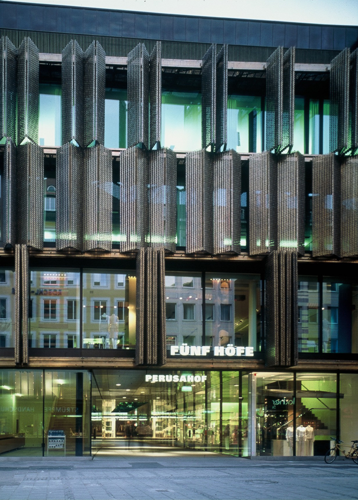
……and the 53rd Street Entrance
I did come in on 53rd, instinctively I suppose, because I’ve always walked into the museum that way, for instance, when I went to those famous exhibitions on Picasso, Matisse and Twombly. Actually, the entrance to the traditional core of the MoMA, the white marble building designed by Goodwin and Stone, is the way countless first-time visitors quite naturally enter the recently inaugurated new museum complex. Looking at it from outside, you don’t see much of a change on 53rd Street. But the street front has become more open, more transparent, so that you can even sense the green of the sculpture garden from outside. In fact, the facades have become more permeable to light in general although little has changed architecturally. The activities inside the museum now reach out into the city, through the translucent glass of the G+S building and through the steel structure of the East Wing. Even the Pelli facades have hardly changed. But although architectural change has been kept to a minimum there, it’s enough to break up the monotony of the eighties street front, for instance, by emphasizing the window frames in places where a daylight connection has been established between the exhibition space and the street.
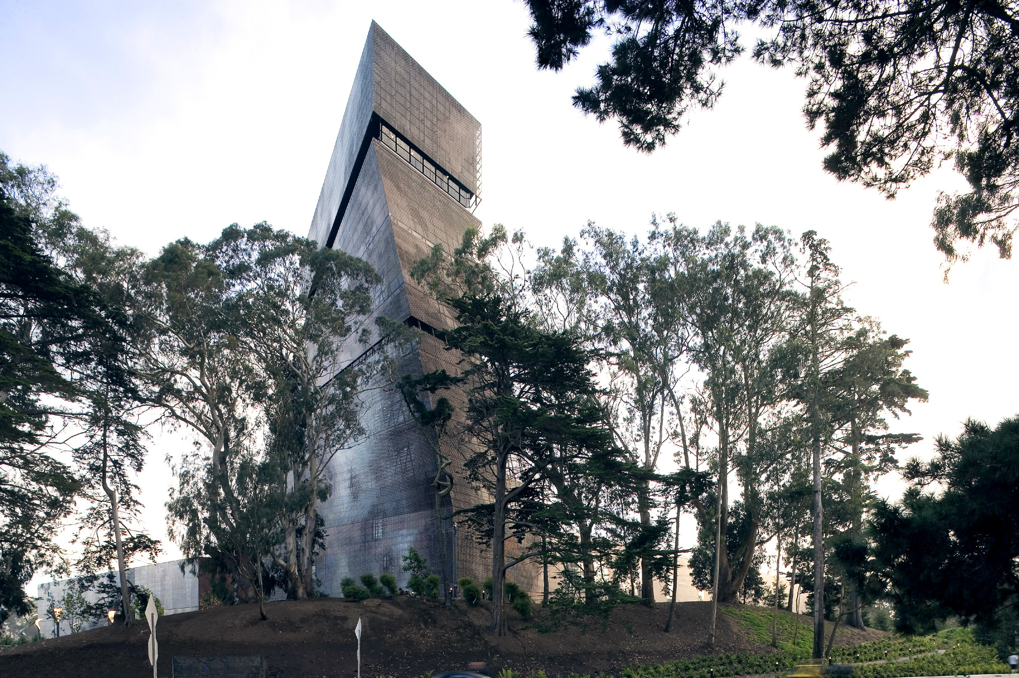
The Curatorial Tower
And what do you think of the Curatorial Tower being surrounded by all the history-laden MoMA buildings?
The high-rise structure is particularly important on this side because it counterbalances the Museum Tower. Even though its not as weighty, it still has a powerful architectural aura. It marks the entrance for all those who spend their working days at the MoMA and provides access for groups that want to use the Education Centre. The tower also contains everything related to the sectors of education and research.
Last night I took a look at the Curatorial Tower myself since it’s been the subject of so much debate. It really does look entirely different from each side. It’s not a geometrically clear-cut shape like most of the high-rise buildings in Manhattan. The cloudy weather today makes it look very bright and crystalline, almost like a monolith, but last night it reminded more of a wire frame or a grid, with various activities concentrated at the inter- sections.
Spontaneously the Curatorial Tower reminds me of Giacometti’s sculpture „The Cube“ – maybe because of what you call its monolithic appearance, which is particularly noticeable today. I like this associative aspect of the building although I have the impression that the architects came up with their design from a more minimal and mathematical point of view. The verticals and diagonals are a geometrical response to the zoning laws at this location in Manhattan. I don’t really think there’s any deconstructive, neoexpressive or symbolic intent behind the design.
True, I also sense this minimal, clear vocabulary, but the building still has something figurative about it. It’s not an abstract construct, it contains a gesture, a kind of movement. To begin with, it joins the existing buildings on 53rd Street: Goodwin and Stone, Johnson, and Pelli. It’s clearly situated on 53rd and looks over at 54th, so to speak. You might say it addresses the new parts of the museum, the roof gardens and the sculpture garden. To me, this gesture of taking a look at the other side, at the MoMA site, is what makes the building so special and new and exciting. It’s not because of its landmark impact, even if it does look pretty spectacular from both 5th and 6th Avenues, but rather because of the content of the landmark, because it seesaws between abstraction and figuration.
And the function of the building? Don’t you think it’s rather odd for the new MoMA to be architecturally dominated by the Curatorial Tower, while the architectural language of the exhibition spaces is more reserved and integrated into Manhattan’s orthogonal grid? Does it make sense for research, services, administration and education to carry so much architectural weight in a museum of the 21st century?
So many people are involved in art behind the scenes organizing, restoring, building crates and frames, writing essays and letters, working on fund- raising, studying and appraising photographs, paintings, drawings, sculp-tures, architecture and prints. Should all these people just be “accom- modated” in some anonymous office structure? It must be much more motivating to walk into this Curatorial Tower everyday – they all use the same staff entrance on 53rd – where the different shape of every single floor is enhancing the specific character of each department. I think it’s important for all of the MoMA’s activities, and not just the exhibition spaces, to be adequately and visibly expressed in the architecture. The glass shell of the building encases both the exhibition area as well as the Curatorial Tower. I think the architects were looking for a kind of umbrella factor for the structured variations in the shapes of the buildings.
Glass Shells: Transparent, Translucent, Printed, Etched…
The glass shell is not uniform and homogeneous as in traditional modern office buildings. The surfaces may be transparent, translucent or opaque. Variations in appearance are achieved by printing or etching the glass. So sometimes it doesn’t look like glass at all but more like stone. At times it reminds me of white marble, almost like the Goodwin and Stone building; at other times the treated glass even looks like water. I’ve seen other buildings that these architects designed where building materials, glass or metal, looked deceptively like wood or stone, or as if they were natural surfaces of water or moss. The result is a vitality, a kind of animation, that allows the buildings to communicate a variety of impressions, like the two very different impressions that you had last night and this morning. Monet, for example, explored this phenomenon over and over again in motifs like piles of hay, cathedrals, or the water lilies in his garden.
Contemporary artists do that too, like Dan Graham. But he also incorporates the viewer: people see themselves seeing in his installations and are seen by others at the same time. I like that because you’re drawn directly into the work through your own act of perception or simply through playful response.
The New Roof Garden, Designed by Artists
Did you see Dan Graham’s installation in the roof garden on the fifth floor? He worked with a woman from Holland who’s a landscape architect. They put up three pavilions each representing different kinds of garden architecture.
Isn’t the library up there near the roof garden?
Yes. In fact, you can see the light from the library through the plants because it’s been designed around the roof garden. It must be a wonderful atmosphere to work in. I also like the idea of the roof garden being used as an outdoor gallery, open to the public. Architecturally, it provides an interface between the public and the staff, and it complements the Sculpture Garden.
Well, yes, if people ever get as high as the fifth floor.
I don’t see a problem there. The site is so attractive and the activities so varied that it will probably attract too many people. The fourth floor houses the Departmental Galleries for Drawings and Prints, a café bar with an outdoor terrace where you can enjoy the evening sun over 54th Street, and access to the roof garden. The exhibitions in the roof garden, focusing on a combination of art – landscape – architecture, may also be coordinated with exhibitions in the Departmental Galleries or one of the main exhibitions.
Temporary Exhibitions
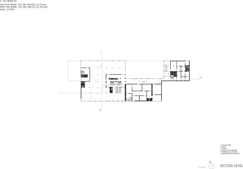
I’ve just been to one of these major shows – „American Sculpture in the 20th Century“. You absolutely have to see it! The whole 2nd floor between 53rd and 54th Street is one huge, undivided space. It must be about 200 ft long and more than 20 ft high. And you can look out onto the street at both ends, so that you’re in there with the sculptures but you and the sculptures are part of the city as well. With all the spatial and architectural variety in the complex, it comes as a really dramatic surprise to find that there’s room for such a huge space. Of course, it’ll have to be subdivided for most future shows to provide the necessary intimacy and do justice to the scale of the works on display. But for the American sculptures, it’s a magnificent context. It reminds me a little of Judd’s Marfa presentation.
But aren’t smaller sculptures dwarfed in a space like that?
There are rooms on either side of the big hall scaled to the needs of smaller formats.
The Rhythm of the Collection and the Rhythm of the Rooms
I think it is extremely important for the scale of a room to match the scale of the work on display. I was in the Museum Collection and really enjoyed the sequence of the rooms; you feel the rhythm of the collection itself, and there’s even a rhythm to the sections of the building. You can really tell where you are within the entire complex. The way the art is sequenced and the sequencing of the exhibition spaces interact in a way that seems perfectly self-evident.
In the Centre: the Abby Aldrich Rockefeller Sculpture Garden
What role does the sculpture garden actually play in the new MoMA? How did it change?
The garden has become the heart and the centre of the museum. It has been shortened and now has its original proportions again. It is adjoined on three sides by exhibition spaces which afford a wonderful view of the garden. It’s as if the art and the visitors were embracing the garden.
The Museum Collection
Isn’t it tiring and overwhelming to tour this giant collection?
As I said before, the sequencing of the works and the rooms has a rhythm that I find extremely convincing. And at intersections, interstitial spaces as they’re called, a special atmosphere has been created. The spaces are designed to provide relaxation, reorientation and information as needed. There are reading zones, video niches and even beverages on sale, and if you’ve had enough for the time being, stairs or elevators lead directly to the main lobby.
I wonder what the exhibition spaces in the venerable G+S building look like now.
The G+S building is the logical place to start the tour of the Museum Collection. In fact, you even have direct access from the main lobby to where the tour begins on the second floor via the old Bauhaus stairs that have been reconstructed. The second floor actually used to be the third floor, that is, the rooms are higher now for the earlier portions of the collection as well.
So you think the restoration and remodeling of the G+S and Philip Johnson buildings was worth it?
Well, you sense the inimitable aura of these two buildings right away. That’s why they assert themselves so successfully next to the new extensions on 54th Street. There is no architectural hierarchy in the complex but only beautifully distinct architectural idioms.
How so?
You notice it in seemingly minor details like the delicate marble stucco in the garden hall of the G+S wing or the restored Bauhaus staircase or the windows that are finally allowed to transmit light again. But, of course, the glass ceilings in the third floor of the new Garden and West Wings and the marvelous daylight they provide are important, too. The etched glass ceilings tie in with the glass facades, establishing not only an architectural link but also a spatial orientation for visitors, so there’s no need for signs or signposts, like in railroad stations.
It’s funny; we keep talking about the architecture. Is it so powerful that it overshadows the art?
You yourself mentioned the spatial advantages that make the encounter with the museum’s extraordinary collection so exciting, and the way they enhance and guide our perception of it…. . I can remember the exact sequence of the Jackson Pollock and Barnett Newman rooms before the museum was remodeled. When you see them today, you feel as if you were meeting them all over again. The same applies to the beautiful early portions of the collection on Cézanne, Picasso and Matisse. And wait till you see the contrast between the former presentation of Monet’s Water Lilies and where they hang now in the new Garden Wing, in a room whose scale has been designed to match them!
I’ve also heard that here are a few new highlights that the museum has finally been able to put on view. Is it possible to find these things in, such a huge presentation?
I haven’t even seen everything myself. Instead I’ve concentrated on a few things that I absolutely wanted to see, for instance, Gerhard Richter’s cycle 18. Oktober 1977. Because of the spatial rhythm that we’ve already talked about, it was easy for me to find Richter’s paintings without having to cover the entire collection. The Richter presentation is as impressive as it was in Haus Esters in Krefeld. Incidentally, in an adjacent room there are photographs by Reinhard Mucha…
The Departmental Galleries
You mean to say that photographs from the Departmental Collection are on view in conjunction with paintings and sculptures from the Museum Collection? Doesn’t the Photo Department have gallery spaces of its own anymore?
Of course it does. The Departmental Galleries are all very prominently placed and can be accessed both directly from the main lobby as well as on tour through the building. The exhibition spaces for the Departments of Photography and of Architecture/Design are both located in the Garden Wing. Interesting connections have been made in the presentation of the Museum Collection by showing certain photographs, prints, videos or architectural models in conjunction with paintings and sculpture. For example, photographs by Atget are near paintings by de Chirico, and a Becher series is associated with Judd’s Steel Boxes.
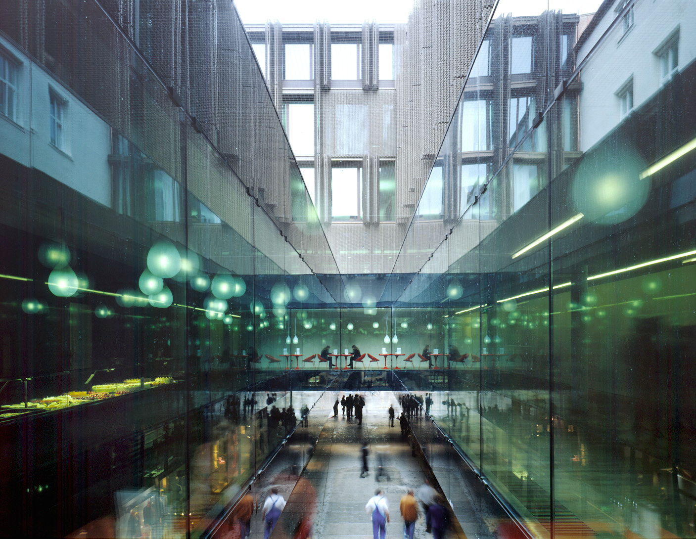
The Garden Continues on into the Lobbies
Curators and museum directors are always stressing the importance of making art visible and tangible as soon as visitors enter a museum. But walking into a lot of new museums is like walking into a bank or an insurance company. The architectural and spatial design does nothing to foster the encounter with art. A large-format painting may, of course, be (ab)used to break up the monotony of a long wall or a particularly robust sculpture will function as a kind of art signpost…..
…you certainly can’t complain about that here. There’s so much on offer even before you’ve bought your ticket. Just a diagonal stroll across the two is a fascinating artistic experience. It’s really an enhancement of Manhattan.
Did you take a closer look at the new lobby in the G+S building? They’ve removed the ceiling so that the space is now much higher. It also looks wider and more generous The view of the Sculpture Garden is much more immediate, more direct;it spreads out before you like a huge picture.
Like a tableau vivant?
It’s not meant to be an optical illusion, the impression is real. The garden continues on into the lobby with sculptures and objects from the collection placed there as well. It’s like a spatial and temporal (chronological) extension of the Sculpture Garden down to more recent contemporary art. There are a few marvelous pieces by Flavin, Judd, André, Artschwager,
Bourgeois ….
And Tony Smith’s Moondog! It’s almost weird to see so much high quality art accumulating in one venue. I’d only seen pictures of this work in the New York Times a few years ago and had always wanted to see it “live.”
It’s also so much fun to see how works unfold in the 23-foot-high lobby without being engulfed. And they aren’t eclipsed by visitors’ services either. Areas like ticketing or the coat check are designed as inconspicuously as possible, though you can still locate them immediately.
Circulation and Orientation
Actually I was surprised how quickly I found my way around this morning: it didn’t even seem crowded although there were so many visitors not even in the area around the escalators. To tell you the truth, I had hoped the new MoMA would be able to do without them… .That’s probably a naive thought considering how many people have to be accommodated. But you can also take the elevator directly to any place you want. The whole layout is clear and uncomplicated. And I think the escalators are very well placed on the north side of the MoMA Tower where.
I still prefer using the stairs or the elevator.
Stairs! Nobody walks up stairs anymore.
But have you really looked at them? They each have a special character of their own. They’re all architecturally formed and an important, distinctive element of design in each part of the building: the old, reconstructed Bauhaus stairs in the G+S building, the curved, free-standing stairs in the Titus lobby, the stairs in the atrium of the Garden Wing or the ones facing the corner of 54th Street that afford an attractive view of the city. These last ones are especially interesting because they also lead directly from the 54th street lobby to the outdoor exhibition space above the Loading Docks. It’s gigantic 6000 sq. ft.
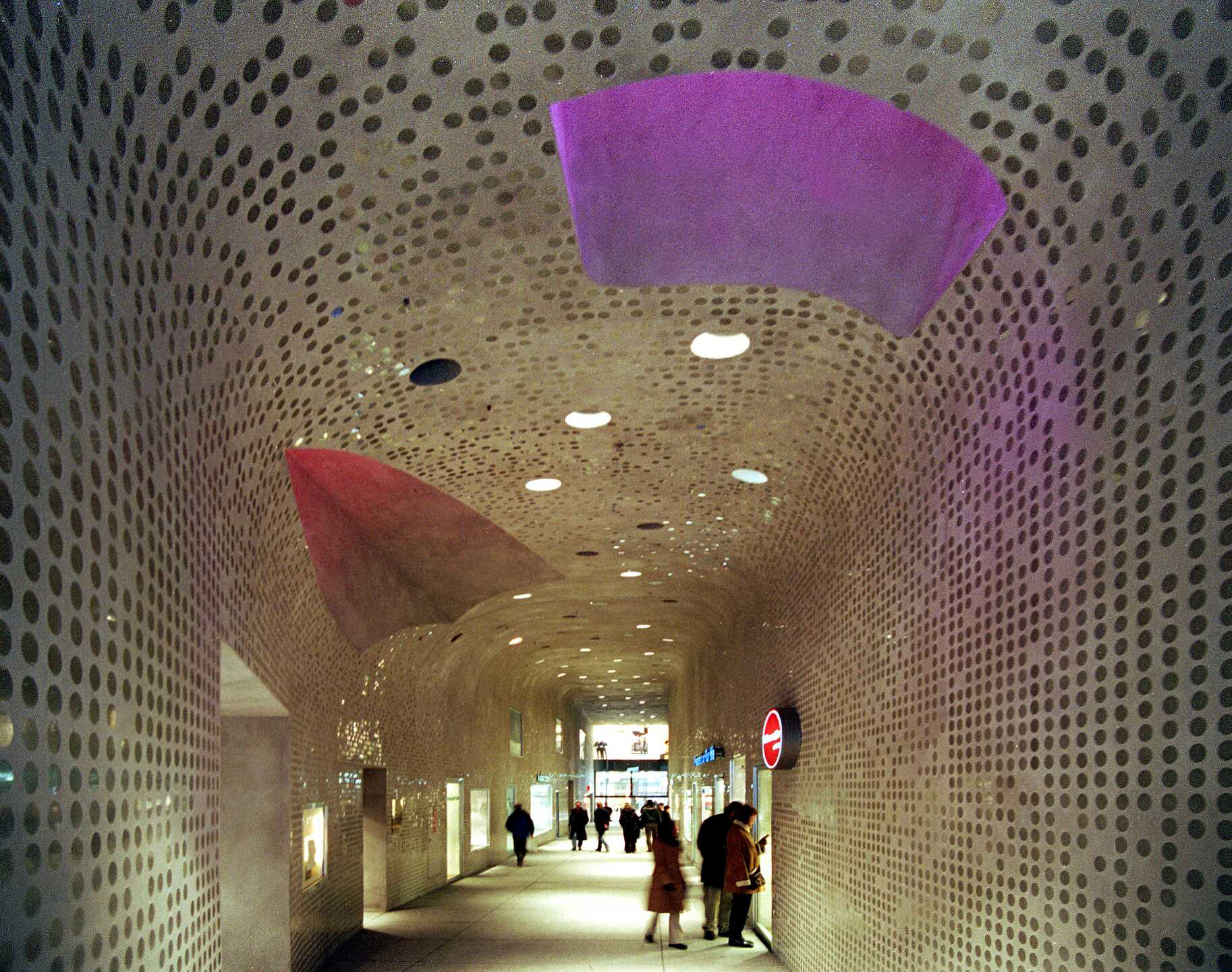
An Outdoor Exhibition Space of 6000 Square Feet
I haven’t been there yet but I did look down onto it from the second floor. It’s pretty surprising to come out of one of the temporary exhibitions into this glazed, catercorner interstitial space. You look straight out onto the buildings of Manhattan and down below you can see the sculpture court. The court has a terrain vague feeling to it; it’s a counterpoint to the clearly defined Sculpture Garden. The MoMA definitely needed to have a site that is a little bit cruder and can be used for really big formats.
Future Expansion
What do you think about future developments?
You’re insatiable! Should the MoMA really continue to keep expand? Aren’t there any limits to the growth and physical extension of museums?
There are certainly museums where you sense that further expansion would not be a material improvement, as in the Louvre. But modern and contemporary art are different; they’re an exciting ongoing project; it’s still unfinished. After all, don’t we all hope that art will bring vital impulses for the development of human society in the 21st century? At least that’s my view, otherwise I wouldn’t even be interested in this new complex. It’s so exciting only because the variety and concentration of the rooms allows for such an unbelievably intense and heterogeneous encounter with the art on display.
But with further expansion, wouldn’t this encounter deteriorate into a shopping mall excursion?
But I love the Museum Shop. Have you seen it? It’s a great place to go not only after but even before you’ve been through the galleries. Everybody passes it on the way to the elevator or the escalator.It’s pretty big and I must say, I think it’s very inviting with places to sit and a corner for kids to play in. That’s an important aspect of visiting a museum, too.
What kind of an extension would you envision? What would be desirable? In terms of city planning, I think seamless expansion on 53rd and 54th Streets a bit dull. Besides, it’s absolutely vital to maintain the heterotopic character of the entire complex.
You’d also have to pursue the idea of the garden and the artificial landscape that originated in the Sculpture Garden and has been elaborated in the roof garden, in ponds and plants along 54th Street, and in the outdoor exhibition space. The central longitudinal axis of the building could simply be extended to the west.
A Fictional True Story
Come on, let’s go to the new Sette MoMA restaurant on the roof of the Garden Wing. Apparently that part of the building has been designed by another architect. It’s amazing that the architects accept and even seem to relish the fact that their architectural world isn’t the only one viable one. Anyway, there’s a beautiful view of the entire museum complex from up there and besides, I’m starved …
(…)
So here we sit envisioning our dream museum of the 21st century, as we look at the Curatorial Tower, the Sculpture Garden, and the gentle play of the plants reflected in the pond on the roof.
Yes, quite so. We’ve also always been interested in the immaterial, mental quality of architecture, which is why we delight in becoming familiar with something new or renewing something familiar. This immaterial, mental architectural work is ultimately the inviolable precondition of architecture both in its implemented or non-implemented form.
Herzog & de Meuron, 1997